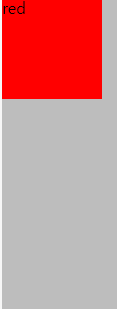
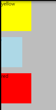
1. 기본 stacking order
html에서는 쓰여진 순서대로 차례차례 쌓이는(stack) 것이 기본이다.

<html>
<div class="yellow">yellow</div>
<div class="blue">blue</div>
<div class="red">red</div>
<css>
.yellow {
    height: 100px;
    width: 100px;
    background-color:yellow;
}
.blue {
    height: 100px;
    width: 100px;
    left:50px;
    background-color:lightblue;
}
.red {
    height: 100px;
    width: 100px;
    left:100px;
    background-color:red;
}
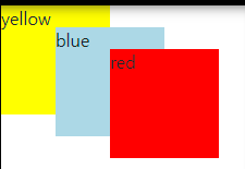
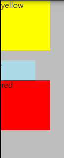
2. 부모-자식 parent-child
그런데 HTML 요소 간에 계열이 있다면, 부모 위에 자식이 올라온다.
노랑(부모) - 파랑(자식) 간의 계열로 바꾸면 파랑이 노랑색보다 위에 있다.
<div class="yellow">yellow
<div class="blue">blue</div></div>
<div class="red">red</div>
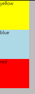
3. CSS- position
기본 position은 static이다. 이것은 HTML의 모든 규칙을 따른다.
position의 속성은 크게 4가지가 있다.
position: absolute
position: relative
position: fixed
position: sticky
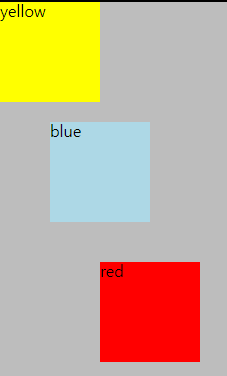
3-1. CSS- position - <absolute>
absolute는 절대적이라는 뜻이다.
특정 요소의 HTML이 absolute일 때는, 부모의 위치가 기준이 된다.
그리고, HTML의 기본 흐름에서 빠져나오기 때문에 다른 요소들에 영향을 미친다.
<html>
<div class="yellow">yellow</div>
<div class="blue">blue</div>
<div class="red">red</div>
<CSS> 기본
-position을 absolute로 바꾸면, 아래와 같은 모습이 된다.
빨강, 노랑, 파랑 모두 한 자리에 겹쳐져 위치한다.
div {
    height:100px;
    width:100px;
    position:absolute;
}

.yellow {
    background-color:yellow;
}
.blue {
    background-color:lightblue;
}
.red {
    background-color:red;
}
<CSS> 도형을 나란히 배치한 것
아래의 CSS코드를 살펴보자.
-yellow의 부모 요소는 body이다.
body를 기준으로 배치되었다.
-blue의 부모 요소 역시 body이다.
left:50픽셀이므로, 왼쪽 바디를 기준으로 50픽셀 떨어져 위치한다.
-red의 부모 요소 역시 body이다.
left:100픽셀이므로, 왼쪽 바디를 기준으로 100픽셀 떨어져 위치한다.
div {
    height:100px;
    width:100px;
    position:absolute;
}

.yellow {
    background-color:yellow;
}
.blue {
    left:50px;
    background-color:lightblue;
}
.red {
    left:100px;
    background-color:red;
}
<CSS> 도형을 사선으로 배치한 것
아래의 CSS코드를 살펴보자.
-yellow의 부모 요소는 body이다.
body를 기준으로 배치되었다.
-blue의 부모 요소 역시 body이다.
left:50픽셀이므로, 왼쪽 바디를 기준으로 50픽셀 떨어져 위치한다.
top:20픽셀이므로, 위쪽 바디를 기준으로 20픽셀 떨어져 위치한다.
-red의 부모 요소 역시 body이다.
left:100픽셀이므로, 왼쪽 바디를 기준으로 100픽셀 떨어져 위치한다.
top:40픽셀이므로, 위쪽 바디를 기준으로 40픽셀 떨어져 위치한다.
div {
    height:100px;
    width:100px;
    position:absolute;
}

.yellow {
    background-color:yellow;
}
.blue {
    left:50px;
    top:20px;
    background-color:lightblue;
}
.red {
    left:100px;
    top:40px;
    background-color:red;
}
3-2. CSS- position - <relative>
<CSS 기본>
position을 relative로 두면 static과 같이 아래로 나란히 위치한다.
div {
    height:100px;
    width:100px;
    position:relative;
}

.yellow {
    background-color:yellow;
}
.blue {
    left:0px;
    top:20px;
    background-color:lightblue;
}
.red {
    left:0px;
    top:40px;
    background-color:red;
}
<CSS>
여기에 margin을 추가해보면 static과의 차이를 알 수 있다.
-yellow의 기준이 되는 요소는 자신(div)이다.
자신을 기준으로 배치된다.
-blue의 기준이 되는 요소 역시 자신(div)이다.
left:50픽셀이므로, 원래 있었던 blue div의 왼쪽을 기준으로 50픽셀 떨어져 위치한다.
top:20픽셀이므로, 원래 있었던 blue div의 위쪽을 기준으로 20픽셀 떨어져 위치한다.
-red의 기준이 되는 요소 역시 자신(div)이다.
left:100픽셀이므로, 기존의 red div의 왼쪽을 기준으로 100픽셀 떨어져 위치한다.
top:40픽셀이므로, 기존의 red div의 위쪽을 기준으로 40픽셀 떨어져 위치한다.
div {
    height:100px;
    width:100px;
    position:relative;
}

.yellow {
    background-color:yellow;
}
.blue {
    left:50px;
    top:20px;
    background-color:lightblue;
}
.red {
    left:100px;
    top:40px;
    background-color:red;
}
<CSS> right쪽으로 이동해보자.
-blue의 기준이 되는 요소는 CSS값이 적용되지 않은 자신(div)이다.
right:30픽셀이므로, 원래 있었던 blue div의 오른쪽을 기준으로 30픽셀 떨어져 위치한다.
top:20픽셀이므로, 원래 있었던 blue div의 위쪽을 기준으로 20픽셀 떨어져 위치한다.
div {
    height:100px;
    width:100px;
    position:relative;
}

.yellow {
    background-color:yellow;
}
.blue {
    right:30px;
    top:20px;
    background-color:lightblue;
}
.red {
    left:0px;
    top:40px;
    background-color:red;
}
<CSS> bottom 쪽으로 이동해보자.
-red의 기준이 되는 요소는 CSS값이 적용되지 않은 자신(div)이다.
bottom:40픽셀이므로, 원래 있었던 blue div의 아래쪽을 기준으로 40픽셀 떨어져 위치한다.
div {
    height:100px;
    width:100px;
    position:relative;
}

.yellow {
    background-color:yellow;
}
.blue {
    right:30px;
    top:20px;
    background-color:lightblue;
}
.red {
    left:0px;
    bottom:40px;
    background-color:red;
}
3-3 absolute 속성 복습하기
<!DOCTYPE html>
<html>
<head>
<style>
div.a {
  position: relative;
  width: 400px;
  height: 200px;
  border: 3px solid red;
}

div.b {
  position: absolute;
  right: 8px;
  width: 100px;
  height: 180px;
  border: 3px solid blue;
}

div.c {
  position: absolute;
  right: 150px;
  width: 200px;
  height: 120px;
  border: 3px solid green;
}
</style>
</head>
<body>

<h1>The right Property</h1>

<div class="a">빨강 div의 position: relative;
  <div class="b">파랑 div의 position: absolute이고, 부모인 빨강 div의 오른쪽을 기준으로 8픽셀 만큼 떨어져있다.</div>
  <div class="c">초록 div의 position: absolute이고, 부모인 빨강 div의 오른쪽을 기준으로 150픽셀 만큼 떨어져있다.</div>
</div>

</body>
</html>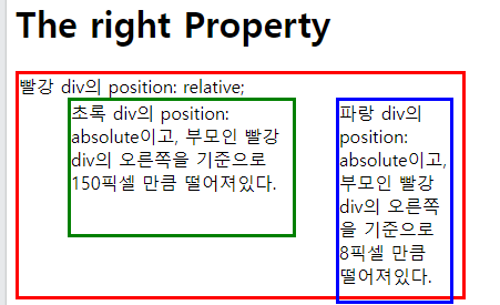
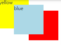
4. z-index
z-index는 요소를 쌓는 순서에 관한 속성이다.
z-index=0값이 기본이다.
이보다 숫자가 작아지면 아래로, 숫자가 커지면 위로 쌓인다.
아파트 층을 생각하면 되겠다.
기본층이 0이고, 그 이하는 지하 이상은 지상인 것과 같다.
단, 여기서는 CSS의 position 속성이 중요하다. 정적(기본값, static)이면 안된다.
반드시 아래와 같이 position 속성이 정의되어야 z-index 속성이 적용된다.
position: absolute
position: relative
position: fixed
position: sticky
<CSS>
div {
    height:100px;
    width:100px;
    position:absolute;
}

.yellow {
    background-color:yellow;
    z-index:0;
}
.blue {
    margin-left:50px;
    margin-top:20px;
    background-color:lightblue;
    z-index:1;
}
.red {
    margin-left:100px;
    margin-top:40px;
    background-color:red;
    z-index:-1;
}
https://www.w3schools.com/css/css_positioning.asp
CSS Layout - The position Property
W3Schools offers free online tutorials, references and exercises in all the major languages of the web. Covering popular subjects like HTML, CSS, JavaScript, Python, SQL, Java, and many, many more.
www.w3schools.com
'웹개발 > Bootstrap' 카테고리의 다른 글
| 개발 용어, wet, dry, refactoring, 리팩토링 (0) | 2022.12.15 |
|---|---|
| media query, 미디어쿼리, viewport (0) | 2022.12.15 |
| cards, 카드, 반응형 카드, 버튼 (0) | 2022.12.12 |
| 캐러셀, Carousel, 슬라이드쇼 (0) | 2022.12.11 |
| 아이콘 사이즈, relative sizing, literal sizing, hover (0) | 2022.11.29 |