1. simple linear regression
will refer to one independent variable to make a prediction
y= b+ax
b: the intercept
a: the slope
fit
X: Predictor variable
Y: Target variable
<procedure>
import linear_model from scikit-learn
create a linear regression object using the constructor
define the predictor, target variable
use fit() - fine the parameters b, a
obtain a prediction
from sklearn.linear_model import LinearRegression
lm = LinearRegression()
X = df[['highway-mpg']]
Y = df['price']
lm.fit(X,Y)
Yhat=lm.predict(X)
Yhat[0:5]
lm.intercept_
lm.coef_
multiple Linear Regression
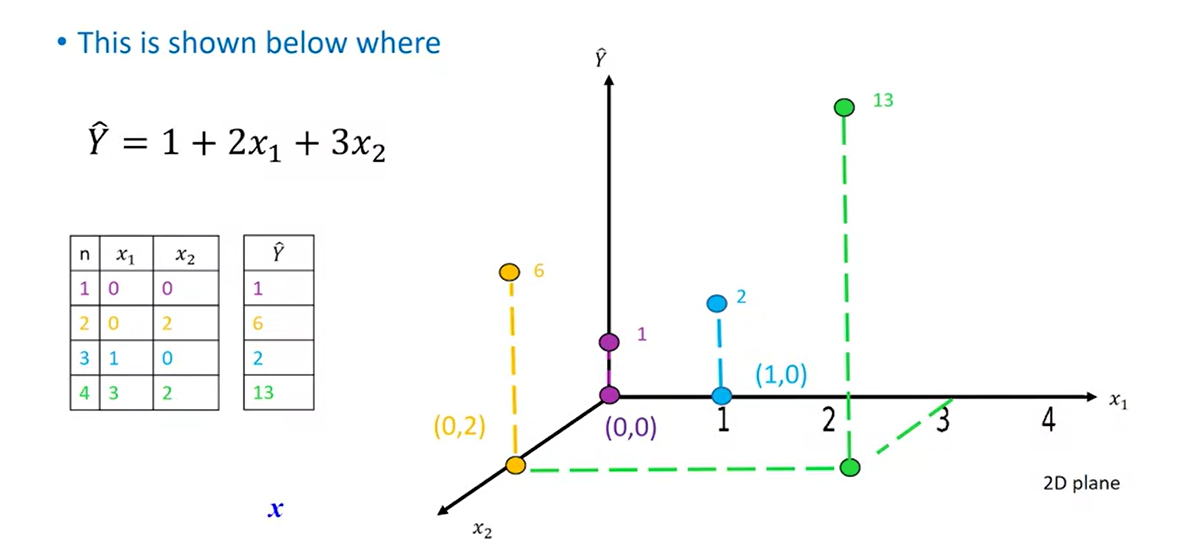
Z = df[['horsepower', 'curb-weight', 'engine-size', 'highway-mpg']]
lm.fit(Z, df['price'])
lm.intercept_
lm.coef_
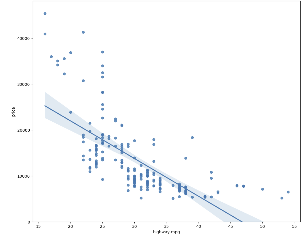
2. model evaluation using visualization
-regression plot
width = 12
height = 10
plt.figure(figsize=(width, height))
sns.regplot(x="highway-mpg", y="price", data=df)
plt.ylim(0,)
-residual plot
width = 12
height = 10
plt.figure(figsize=(width, height))
sns.residplot(x=df['highway-mpg'],y=df['price'])
plt.show()
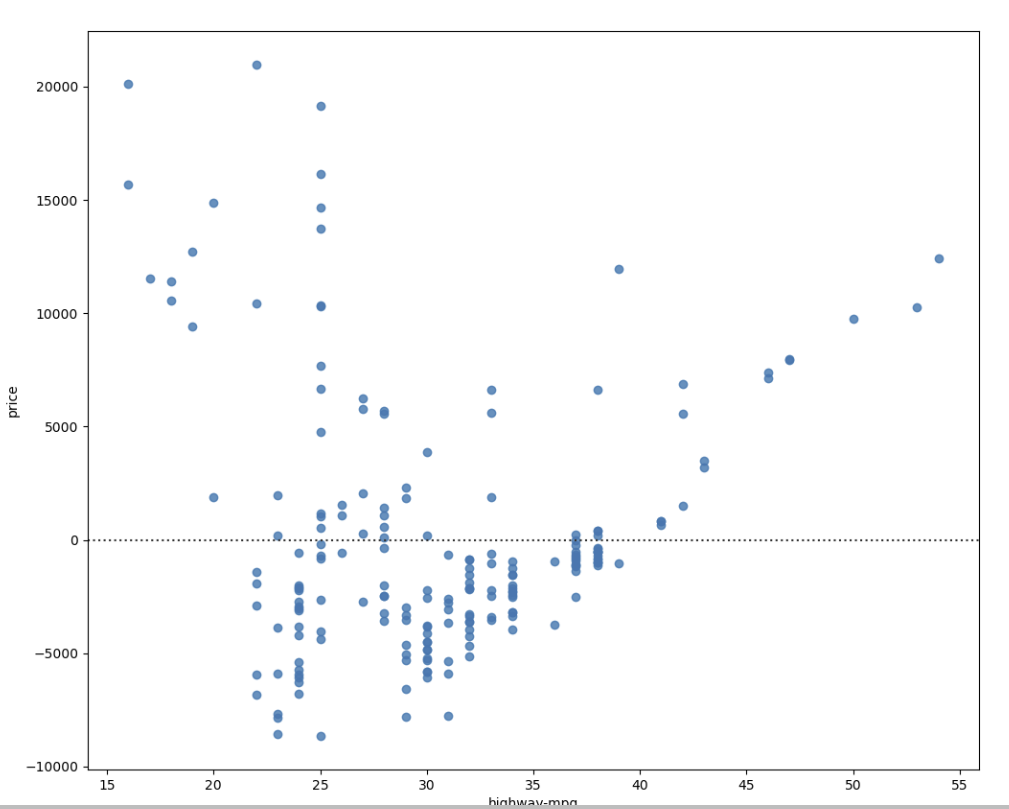
Residual plot은 회귀분석에서 모델의 적합성을 평가하기 위해 사용되는 그래프입니다. 회귀분석에서 모델은 주어진 독립변수와 종속변수 간의 관계를 설명하기 위해 사용됩니다. 이때 모델이 잘 적합된 경우, 종속변수의 예측값과 실제값 사이의 차이가 작아집니다.
Residual plot은 이러한 예측값과 실제값 사이의 차이인 잔차(residual)를 그래프로 표현한 것입니다. Residual plot을 통해 잔차의 패턴을 파악하여 모델이 적합한지, 아니면 더 개선이 필요한지를 평가할 수 있습니다.
Residual plot에서는 x축에 독립변수의 값, y축에 잔차의 값이 표시됩니다. 적합한 모델인 경우, 잔차는 무작위로 분포하며 어떠한 패턴도 보이지 않아야 합니다. 만약 잔차에 패턴이 있다면, 모델이 적합하지 않은 것으로 간주됩니다.
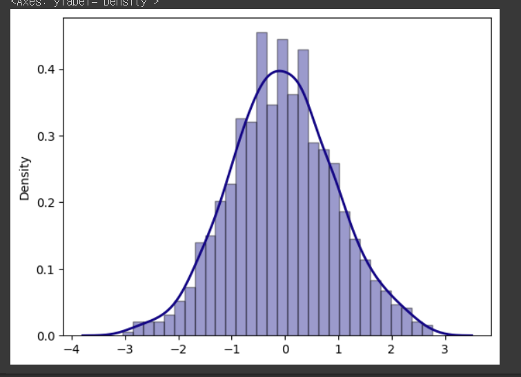
-distribution plots
istribution plot은 데이터의 분포를 시각화하기 위한 그래프 중 하나입니다. 데이터의 분포를 산점도나 히스토그램으로 표현하기 보다는, 밀도 함수를 고려한 부드러운 곡선 형태로 표현하는 것이 특징입니다.
Distribution plot은 seaborn 라이브러리에서 제공됩니다. seaborn의 distplot 함수를 사용하여 그릴 수 있으며, 주로 단일 변수에 대한 분포를 시각화하는 데 사용됩니다.
import seaborn as sns
import numpy as np
# 데이터 생성
np.random.seed(0)
x = np.random.randn(1000)
# Distribution plot 그리기
sns.distplot(x, hist=True, kde=True, bins=30, color='darkblue',
hist_kws={'edgecolor':'black'}, kde_kws={'linewidth': 2})
def DistributionPlot(RedFunction, BlueFunction, RedName, BlueName, Title):
    width = 12
    height = 10
    plt.figure(figsize=(width, height))

    ax1 = sns.distplot(RedFunction, hist=False, color="r", label=RedName)
    ax2 = sns.distplot(BlueFunction, hist=False, color="b", label=BlueName, ax=ax1)

    plt.title(Title)
    plt.xlabel('Price (in dollars)')
    plt.ylabel('Proportion of Cars')

    plt.show()
    plt.close()
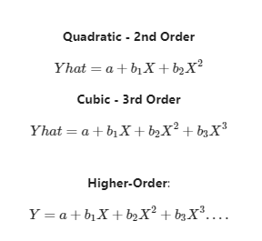
3. polynomial regression and pipelines
1) Polynomial regression
은 일반적인 선형 회귀(linear regression)의 확장된 형태로, 독립 변수(x)와 종속 변수(y) 사이의 비선형 관계를 모델링하는 데 사용됩니다. 다항식(Polynomial)을 사용하여 회귀식을 표현하는 방식으로, 일반적인 선형 회귀에서 사용되는 1차 함수 대신 2차, 3차, 4차 등 다항식 함수를 사용합니다.
PolynomialFeatures는 sklearn에서 제공하는 특성(feature) 변환기(transformer) 중 하나로, 다항식(Polynomial) 특성을 추가하는 기능을 합니다. 이 변환기를 사용하면 선형 회귀(Linear Regression) 등의 모델에서 비선형성(Nonlinearity)을 학습할 수 있습니다. 예를 들어, x라는 변수가 주어졌을 때, x^2, x^3과 같은 변수를 추가하여 모델이 곡선 형태의 데이터에 더 잘 적합할 수 있도록 도와줍니다.
따라서, 데이터셋이 비선형적인 관계를 가지고 있을 때, PolynomialFeatures를 사용하여 다항식 특성을 추가하면 모델의 성능이 개선될 수 있습니다. 이는 일반적으로 다항 회귀(Polynomial Regression)에서 많이 사용되는 방법 중 하나입니다.
- a special case of the general linear regression model.
- useful for describing curvilinear relationships
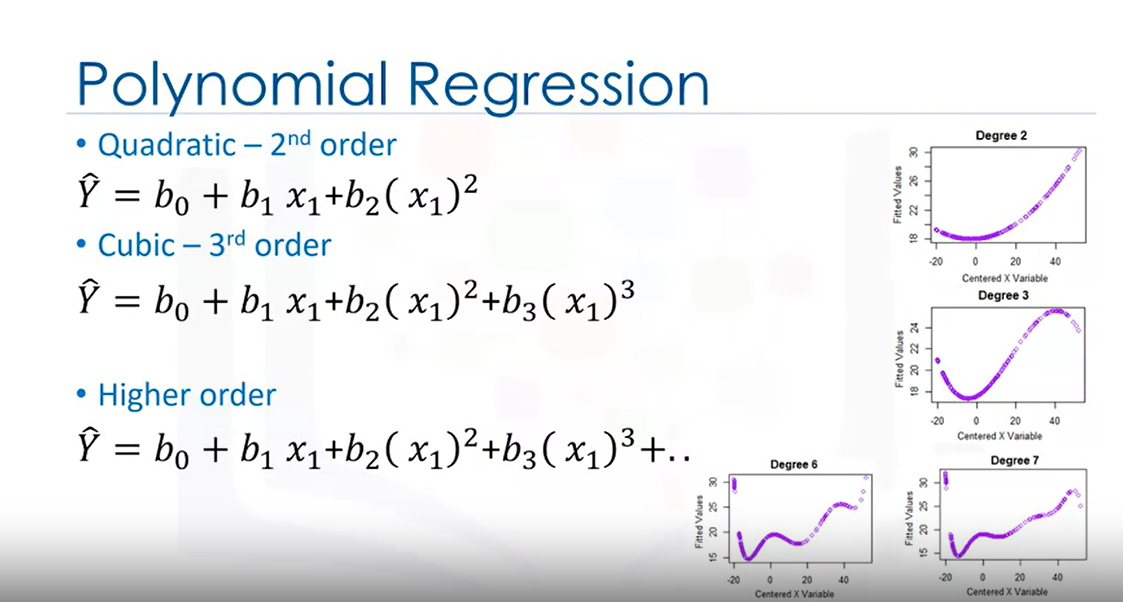
def PlotPolly(model, independent_variable, dependent_variabble, Name):
    x_new = np.linspace(15, 55, 100)
    y_new = model(x_new)

    plt.plot(independent_variable, dependent_variabble, '.', x_new, y_new, '-')
    plt.title('Polynomial Fit with Matplotlib for Price ~ Length')
    ax = plt.gca()
    ax.set_facecolor((0.898, 0.898, 0.898))
    fig = plt.gcf()
    plt.xlabel(Name)
    plt.ylabel('Price of Cars')

    plt.show()
    plt.close()

x = df['highway-mpg']
y = df['price']

# Here we use a polynomial of the 3rd order (cubic)
f = np.polyfit(x, y, 3)
p = np.poly1d(f)
print(p)

PlotPolly(p, x, y, 'highway-mpg')

np.polyfit(x, y, 3)
def PollyPlot(xtrain, xtest, y_train, y_test, lr,poly_transform):
    width = 12
    height = 10
    plt.figure(figsize=(width, height))


    #training data
    #testing data
    # lr:  linear regression object
    #poly_transform:  polynomial transformation object

    xmax=max([xtrain.values.max(), xtest.values.max()])

    xmin=min([xtrain.values.min(), xtest.values.min()])

    x=np.arange(xmin, xmax, 0.1)


    plt.plot(xtrain, y_train, 'ro', label='Training Data')
    plt.plot(xtest, y_test, 'go', label='Test Data')
    plt.plot(x, lr.predict(poly_transform.fit_transform(x.reshape(-1, 1))), label='Predicted Function')
    plt.ylim([-10000, 60000])
    plt.ylabel('Price')
    plt.legend()
2) pipeline
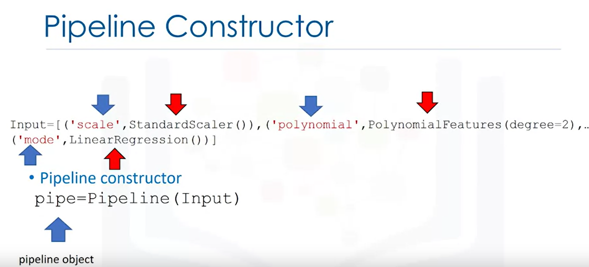
from sklearn.preprocessing import PolynomialFeatures
pr=PolynomialFeatures(degree=2)
pr
Z_pr=pr.fit_transform(Z)
pipeline으로 모든 과정을 한번에!!!!
# 필요한 모든 모듈을 임포트하고
from sklearn.pipeline import Pipeline
from sklearn.preprocessing import StandardScaler
from sklearn.preprocessing import PolynomialFeatures
#파이프라인을 설계한다.
Input=[('scale',StandardScaler()), ('polynomial', PolynomialFeatures(include_bias=False)), ('model',LinearRegression())]
#파이프라인에 집어넣는다!
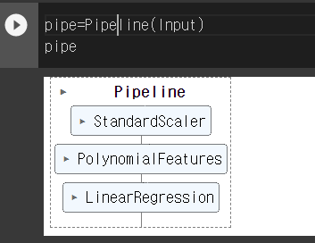
pipe=Pipeline(Input)
pipe
#파이프라인에서 학습한다.
Z = Z.astype(float)
pipe.fit(Z,y)
#결과를 예측한다
ypipe=pipe.predict(Z)
ypipe[0:4]
4. measures for in-sample evaluation
-a way to numerically determine how good the model fits on dataset
-MSE:mean squared error
Yhat=lm.predict(X)
print('The output of the first four predicted value is: ', Yhat[0:4])

from sklearn.metrics import mean_squared_error
mse = mean_squared_error(df['price'], Yhat)
print('The mean square error of price and predicted value is: ', mse)
-R-squared:
-measure to determine how close the data is to the fitted regression line
R-squared는 회귀 분석에서 사용되는 평가 지표 중 하나입니다. 이 값은 모델이 주어진 데이터를 얼마나 잘 설명하는지를 나타냅니다. R-squared 값은 0과 1 사이의 값으로 표현되며, 1에 가까울수록 모델이 데이터를 더 잘 설명하고 있다는 의미입니다.
보통 R-squared 값이 높을수록 모델의 성능이 좋다고 평가합니다. 하지만 이 값이 1에 가까워지면 overfitting이 발생할 가능성이 높아지기 때문에, 모델을 평가할 때에는 다른 지표와 함께 고려하는 것이 좋습니다. 또한 R-squared 값은 데이터에 따라 다르게 나타날 수 있기 때문에, 모델의 성능을 평가할 때에는 다른 지표와 함께 종합적으로 고려하는 것이 좋습니다.
#highway_mpg_fit
lm.fit(X, Y)
# Find the R^2
print('The R-square is: ', lm.score(X, Y))
5. prediction and decision making
-do the predicted values make sense
-visualization
-measure(mse or r square)